By The Simple Life Colorado
Color is one of the most powerful and most underestimated tools in a home. The right palette can make a room feel larger, warmer, more energizing, or more restful — without changing a single piece of furniture. We talk about color with nearly every buyer and seller we work with in Winter Park and the Fraser Valley, because it's one of the fastest ways to shift how a home feels to the people inside it. Here's what color psychology actually tells us and how to apply it.
Key Takeaways
-
Color affects mood, perceived space, and how long people want to spend in a room.
-
Warm tones and earthy palettes tend to work particularly well in Colorado mountain homes.
-
Accent walls and trim color can do as much work as a full room repaint.
-
When selling, neutral color psychology helps buyers picture themselves in the space.
Warm vs. Cool: The Foundation of Color Psychology
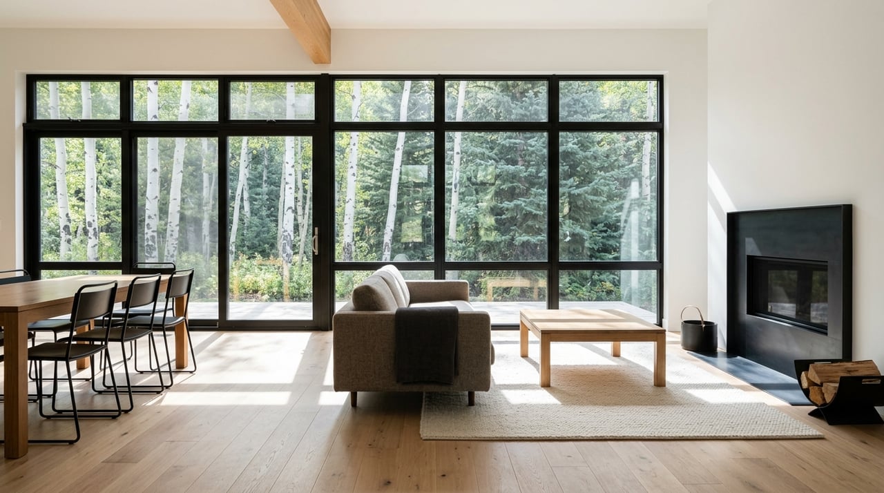
The most important distinction in color psychology for home design is warm versus cool. Warm colors — reds, oranges, yellows, and warm neutrals like cream, terracotta, and warm white — create feelings of energy, coziness, and welcome. Cool colors — blues, greens, grays, and blue-based neutrals — promote calm, focus, and a sense of space.
Neither is inherently better. The question is what you want each room to do. A bedroom benefits from cool, calming tones that support rest. A kitchen or dining area often benefits from warm tones that make the space feel inviting and energetic. In Colorado mountain homes, where the natural landscape outside is already doing a lot of visual work, warm interior palettes tend to complement the setting beautifully.
How to Match Color Temperature to Room Function
-
Bedrooms — cool blues, soft greens, and muted lavenders for rest and calm
-
Living and dining rooms — warm neutrals, terracotta, and earthy tones for gathering
-
Home offices — medium-tone blues and greens for focus without harshness
-
Entryways — warm, welcoming tones that set the tone for the whole home
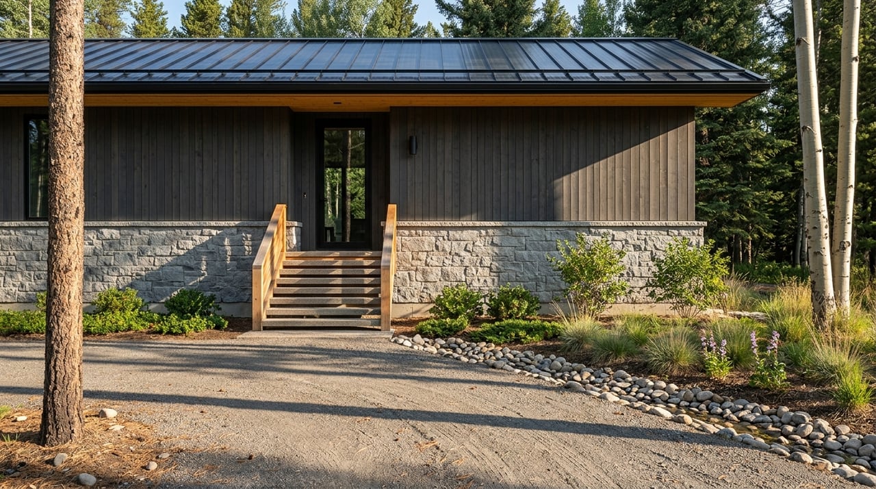
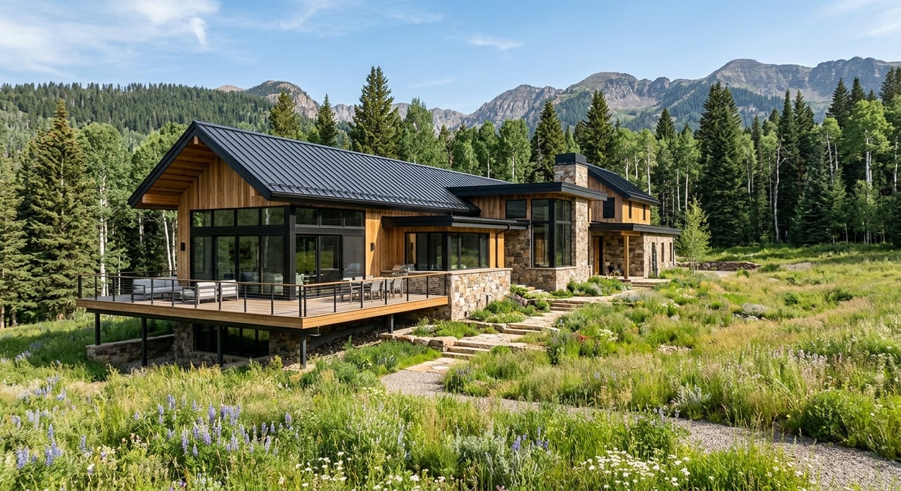
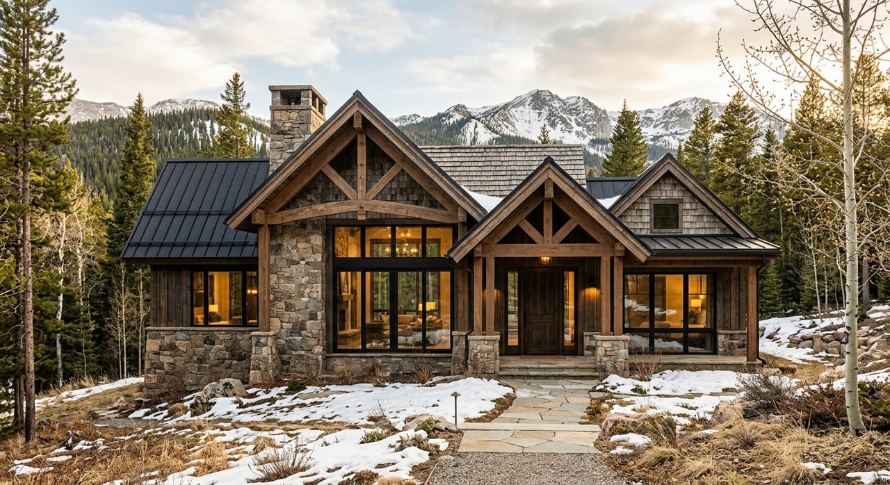
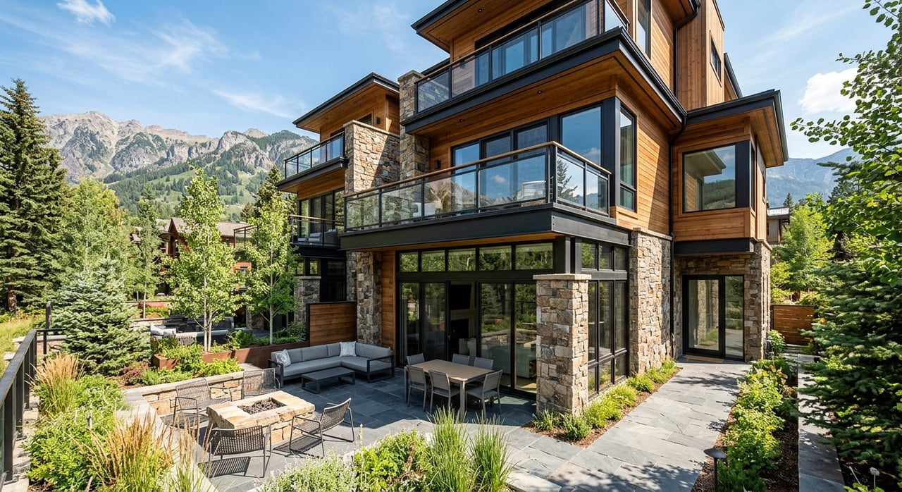
Earthy Tones and the Colorado Mountain Context
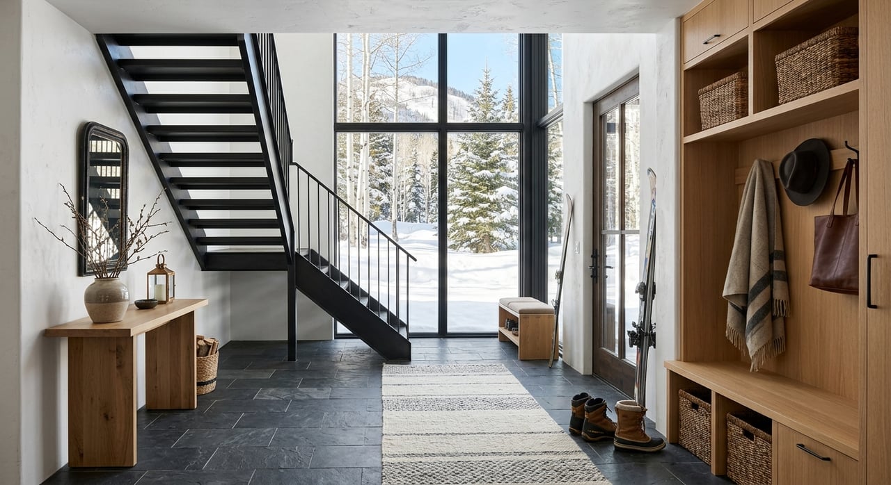
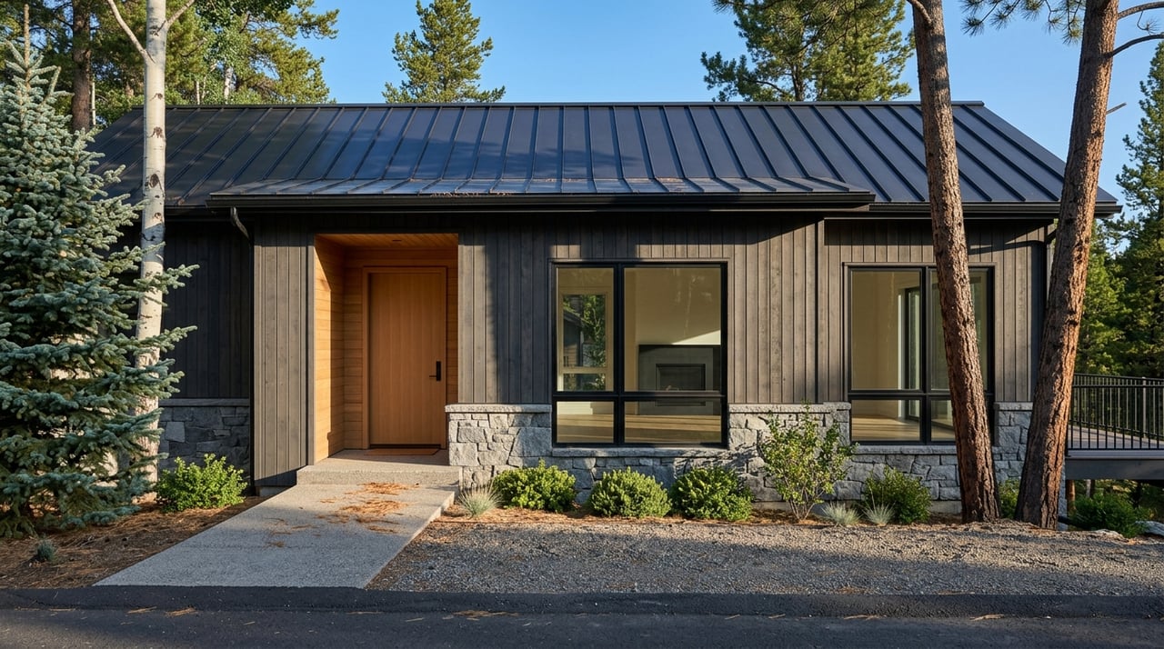
Mountain homes in Winter Park and the Fraser Valley have a natural visual context that most other settings don't — towering pines, open meadows, snow-covered peaks, and a sky that dominates the view from almost every window. Interior color choices that connect to that landscape tend to feel more coherent and settled than those that fight against it.
Earthy tones — warm taupes, soft terracottas, clay, sage green, and warm whites — work particularly well in this setting. They don't compete with the landscape; they extend it inward. Deep charcoal and navy can anchor spaces beautifully when balanced with natural wood tones and warm textiles.
Palettes That Work Well in Colorado Mountain Homes
-
Warm white with natural wood accents — clean, bright, and timeless
-
Soft sage green — connects to the natural surroundings without overpowering
-
Warm taupe or greige — the most versatile neutral for mountain home resale
-
Deep charcoal or navy as an accent — grounding and sophisticated against natural materials
Accent Walls: Maximum Impact, Minimum Commitment
A full repaint is not always necessary to shift how a room feels. An accent wall — one wall in a contrasting or deeper tone — can do significant work in changing the perceived proportions of a room and creating a focal point that gives the space direction.
In a living room, an accent wall behind a fireplace or TV draws the eye and makes the room feel intentional. In a bedroom, an accent wall behind the headboard creates a sense of enclosure and calm without darkening the whole room. In an entryway, a bold accent color makes a first impression that sets the mood for the rest of the home.
Where Accent Walls Work Hardest
-
Behind the fireplace or media wall in a living room
-
Behind the headboard in a primary bedroom
-
On the entry wall guests see first when walking through the front door
-
In a powder room, where a small space can handle bolder color choices
Color and Perceived Space
Color directly affects how large or small a room feels. Lighter colors reflect light and make walls recede, creating a sense of openness. Darker colors absorb light and make walls advance, creating a sense of intimacy and enclosure.
In smaller rooms — a mountain cabin's cozy study or a compact bedroom — this matters. A light color on walls and ceiling can make a room feel meaningfully larger than it is. In larger open-plan spaces, a deeper accent tone can create zones and make the space feel more intimate and intentional rather than cavernous.
Color Rules for Managing Perceived Space
-
Paint ceilings the same color as walls in small rooms to make them feel larger
-
Use lighter tones on walls in rooms with limited natural light
-
Bring darker tones into large open-plan spaces to create definition and warmth
-
Match trim color to wall color in small rooms to eliminate visual breaks that make walls feel closer
Frequently Asked Questions
What's the safest neutral color for a Colorado home going on the market?
Warm greige — a blend of gray and beige with warm undertones — is consistently the most broadly appealing neutral in mountain home markets. It reads as current without being trendy, complements natural wood tones, and lets buyers visualize their own furnishings easily.
How do I know if a color will work before I paint the whole room?
Buy samples and paint large swatches — at least 12 by 12 inches — on the actual wall. Look at them at different times of day and in different lighting conditions. Colors change dramatically between morning light, afternoon sun, and artificial evening lighting, and small paint chips rarely capture that shift accurately.
Does ceiling color matter?
More than most people realize. A bright white ceiling against a warm-toned wall can create an unpleasant contrast. Tinting the ceiling color to a very light version of the wall color — or using a warm white rather than a stark white — makes the room feel more cohesive and settled.
Reach Out to The Simple Life Colorado Today
Color is one of the details we talk through with every client we work with — whether they're preparing a home for the market or moving into a new one and making it their own. We love helping people create homes that genuinely feel right.
Reach out to us at The Simple Life Colorado and let's connect about your home in Winter Park or the Fraser Valley.